Analysis type
Examples

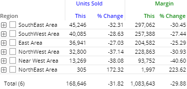
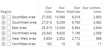
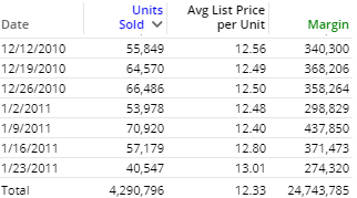
Comparison of members for one or two date ranges; any number of measures

Comparison grid or graph that organizes data by two different attributes (i.e., dimensions) to examine cross-sections of data.

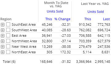
Comparison of members for any number of date ranges; any number of measures

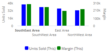
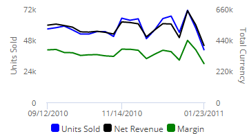
Trend over time for one or two date ranges for multiple measures

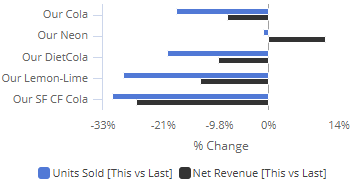
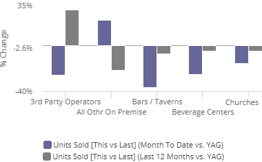
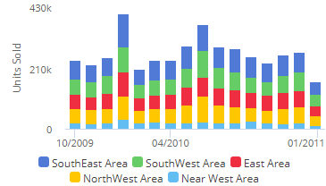
Comparison trend for multiple members; either actual values or percent of the total for single measure

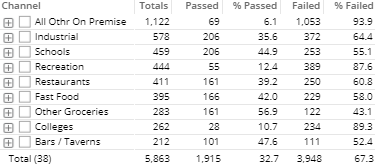
Pass and fail of key members for an exception test (e.g., customers with units >=1)

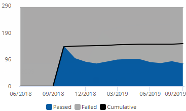
Pass and fail of key members for an exception test over time

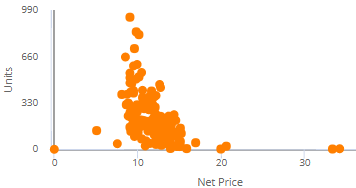
Plot of key members (e.g., customers) for two measures to show trends and outliers

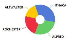
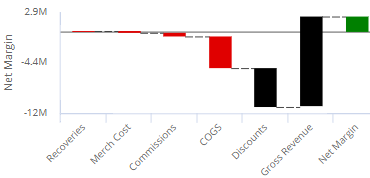
How the components of a calculated measure affect its make-up

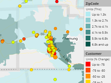
Map showing data values and/or change since another date range

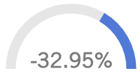
A simple visual tool showing performance; single measure


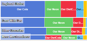
Percent of the total for multiple members for one or two date ranges; any number of measures