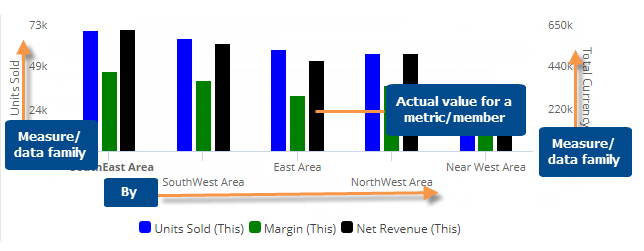
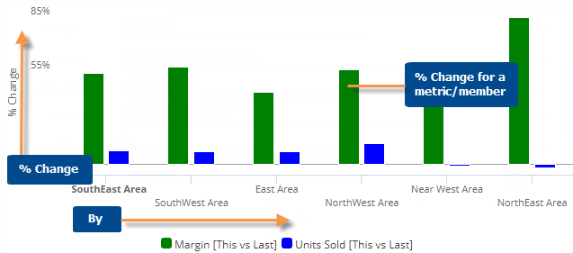
This graph shows either actual values or the percent change for each member of the "Group By" attribute or list so that you can compare them. This graph shows any number of measures.
Actual value comparative graph
Percent change comparative graph
Comparative graph options |
Explanation |
Compare checked or all members |
If you have checked members, you can display only the checked
members or compare all members (i.e., based on sort). Click |
Percent Change or Actual Value (only for comparisons of two date ranges) |
Click |
This and Last, This only, or Last only (only for actual value graphs that compare two date ranges) |
Click |
Vertical or horizontal |
Click |
Axis management |
Click |
Key descriptions (for key graphs only) |
If the graph compares key members, you can select which descriptions (name, ID, address, etc.) are used for labels by switching to a grid, clicking the drop-down arrow on the description heading, and checking the Show On Graph box. |
Visual options (colors, type, size, etc.) |
To access visual options in view mode, click In visual options, choose a color palette and configure each measure by selecting its type (column, marker, or line), size, etc.
|
In graph settings (in explore mode): |
|
- # of members per page |
In graph settings, set the Graph Page Size equal to the maximum number of members to show on one page. If the context has more 1st By members than the selected page size,
then you can use the arrows If the widget size does not fit the page size, then you can scroll to see additional members on the page. |
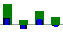
- Overlapping bar graph |
To turn on an overlapping bar graph, go to graph settings and clear the Enable Column Grouping box. Then, in Visual Options, adjust the bar size so that the top bar is the thinnest and the bottom bar is the widest. For example:
|
- Data labels |
In graph settings, check or clear the Enable Data Labels option. |
- Show Totals |
In graph settings, check the Show Graph Total option to include a bar representing the total of all members. |
 in the upper-right corner
to access these options.
in the upper-right corner
to access these options. in the
graph legend (visible on mouseover). Visual options are also available
under graph settings in explore mode.
in the
graph legend (visible on mouseover). Visual options are also available
under graph settings in explore mode. 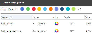

 at the bottom of the widget to go to additional pages.