To customize axes
Before proceeding, add the desired measures.
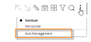
Click
 in the upper-right
corner of the widget, and select Axis Management.

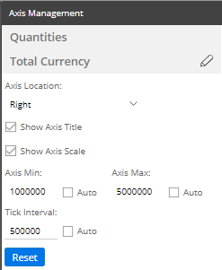
For an actual value graph, choose the axis to customize (e.g., Quantities, Total Currency, etc.). Depending on the selected measures, the graph may include multiple axes, each of which represents a measure or data family.
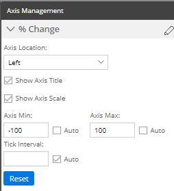
For a percent change graph, all % change data will be plotted along a single axis so this step is not necessary.To change the axis title, click
 (requires Power
Viewer licensing or higher).
(requires Power
Viewer licensing or higher).Choose the axis location.
Show or hide the axis title.
Show or hide the axis scale.
Choose scale settings, including the minimum, maximum, and tick interval. These may be automatic or custom values.
Click Save when you are finished.
Actual value axis settings:

Percent change axis settings:
