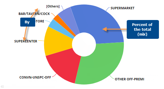
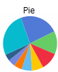
The Mix widget shows the percent of the total or "mix" for each member.
Mix graph options |
Explanation |
# of members shown (i.e., pie slices) |
To show more or fewer members in the graph at one time, click and drag
the slide control |
This or Last data (only in comparisons of two date ranges) |
Click |
Show/hide members |
Click on the member in the legend to toggle it on/off in the graph. |
Show/hide "Others" |
The graph groups all members not shown into its own category (Others).
You can show or hide the Others by clicking |
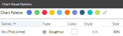
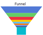
Doughnut, Funnel, or Pie |
Click
|
|
- colors, graph type, etc. |
To access visual options in view mode, click In visual options, choose a color palette and configure the graph type. For doughnut, you can also choose the size of the hole.
|
In graph settings (in explore mode): Labels and/or legend |
In graph settings, you can enable data labels showing percent amounts and/or name labels showing member names. You can also show or hide the legend. |
 in the bottom-left corner of the
widget.
in the bottom-left corner of the
widget.  in the upper-right corner and choose the
timeframe(s) for which you want to display data.
in the upper-right corner and choose the
timeframe(s) for which you want to display data.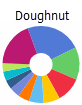
 in the
graph legend (visible on mouseover). Visual options are also available
under graph settings in explore mode.
in the
graph legend (visible on mouseover). Visual options are also available
under graph settings in explore mode.