This graph can be in the following formats: DeltaMap, Mondrian, Stacked Bar, and Unstacked Bar.
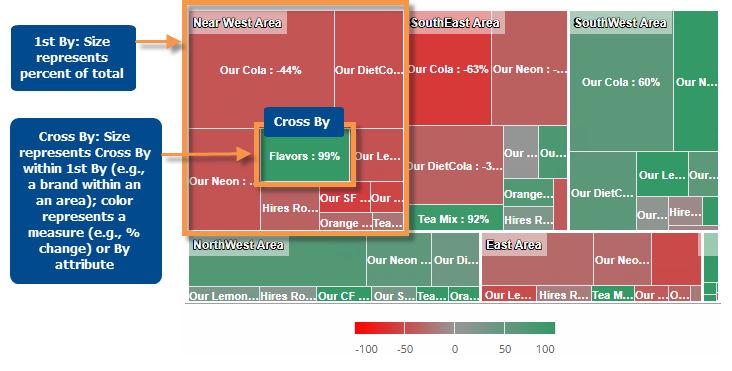
In this graph, major sections represent the members of the first dimension (1st By); these blocks are then divided into subsections that represent the Cross (x) By within the By (e.g., brands within each area). The block size represents a measure (e.g., how much volume) and the color represents another measurement (% change, difference, values, etc.) or a static color. The traditional DeltaMap uses coloring to indicate change so that you can spot the most significant increases and decreases (i.e., largest blocks with the coloring you are concerned about).
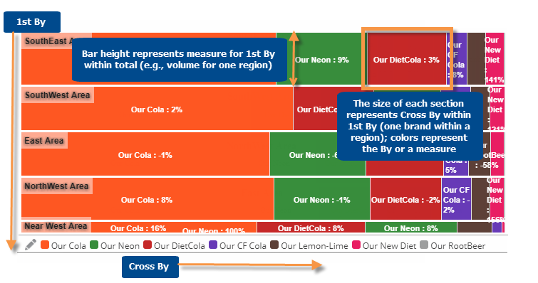
In this graph, each bar represents a member of the first dimension (1st By). The bar width shows the mix (percent of total) for a measure. The bars are then subdivided according to the Cross (x) By (e.g., brands within each area) where the size shows the mix within that category. The colors represent a measure (% change, difference, values, etc.) or a static color based on attribute. The traditional Mondrian uses static coloring to show the top members within each bar.
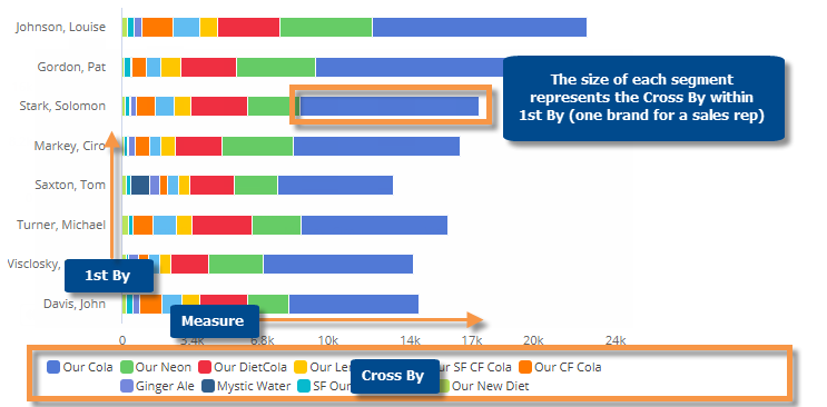
This graph shows each 1st By member as a bar broken down into segments based on the Cross (x) By. The segments and total bar length are sized based on a measure, so you can see the most significant 1st By and Cross By members. The color can represent attributes (i.e. Cross By members) or a measure (% change, difference, values, etc.).
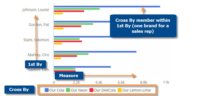
This graph shows a group of bars for each member of the 1st By; the bars represent the Cross (x) By within the 1st By so its easy to compare individual cross-sections of data. The color can represent attributes (i.e. Cross By members) or a measure (% change, difference, values, etc.).
Crosstab graph options |
Explanation |
DeltaMap, Mondrian, Stacked Bar, or Unstacked Bar |
To switch between graph formats, click
|
Compare checked, focus, or all members |
If you have checked members, you can display only the checked
members or compare all members (i.e., based on sort). Click You can also graph just the selected member using the Graph option in this menu. |
Vertical or Horizontal |
Click |
Color and size setup (i.e., visual options) |
Place the cursor over a graph
section to see details about what the size and color represent.
You can click |
In settings (in explore mode): |
|
- # of members/page |
1st By members: In graph settings, choose the Graph Page Size to control the maximum number of 1st By members per page. Cross By members: In grid settings, choose the Column Page Size to control the maximum number of Cross By members per page. |
- Show labels |
You can turn on/off labels using the Enable Data Labels option under graph settings. The labels show whatever data is currently used to color the graph. |
- Show/hide negative data (affects DeltaMap and Mondrian only) |
In graph settings, you can choose to include or exclude negative data. To show negative data, check Graph Positive and Negative Data (on by default). In this case, any negative data will be outlined in red in the graph. To hide negative data, clear Graph Positive and Negative data. |
- Lock CrossBy |
In general settings, you can turn on the Lock Crossby setting to prevent users from changing the Cross By in view mode. This setting also affect drilling in Crosstab graphs:
|
 in the upper-right corner and select from the menu.
  in the
legend to
in the
legend to