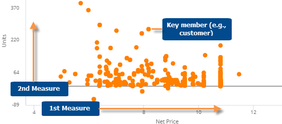
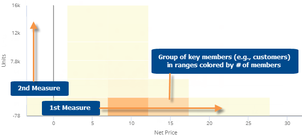
This graph plots key members (e.g., customers), allowing you to see where they fall in the relationship of any two measures. Typically, you see members clustered along a line or curve. The key members that fall far away from the line or cluster may need your attention. The regular format of the Scattergram is a point graph; however, the Scattergram switches to a block format if it contains many members. The default threshold for the block Scattergram is 25,000 members, but can be changed by your administrator.
Scattergram point graph
Scattergram block graph
Scattergram graph options |
Explanation |
Zoom |
In zoom mode (available in
point mode only), you can zoom in on any area of the scattergram
(e.g., on a cluster of points). Click
Click Reset to go back to the original Scattergram. |
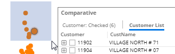
Select key members (i.e., rubber-banding) |
In select mode, you can select
and list any key members to learn more about them. Click
For the rubber-banding capability to be available in view mode, the "allow spawning" option must be on in dashboard settings. |
Filter (block mode only) |
In filter mode (available in
block mode only), you can select an area of the Scattergram to
focus on. All other data will be temporarily filtered out. Click
To return to the original Scattergram, click |
In general settings (in explore mode): Include Nulls |
By default, the Scattergram shows only the key members with data for the selected date range; in other words, it removes null key members. You can include the key members without data by turning on Include Nulls in general settings. |
 in
the upper-right corner to turn on Zoom mode. Then, click and drag
to zoom.
in
the upper-right corner to turn on Zoom mode. Then, click and drag
to zoom.