Your organization can create date lookup tables to allow Dashboard Designers to replace calendar dates with dates that are more meaningful. For example, a lookup table could be used to compare calendar dates with specific business days during the previous timeframe. If configured, date lookups are available in the Advanced date setup area.
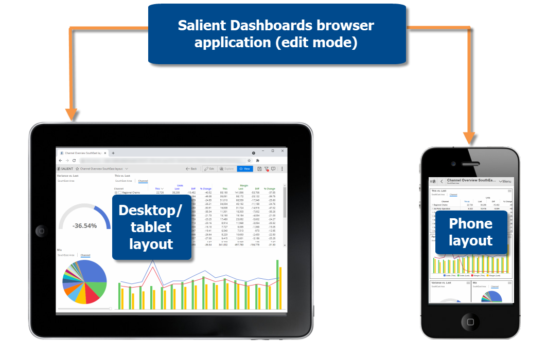
A unified design process within the dashboard browser application lets you control how dashboards appear across different devices. In edit mode, you can build a desktop/tablet layout for browser-based viewing and a phone layout for the mobile app. The desktop/tablet layout may also be used in the mobile app to optimize display on wide screens. Each layout stores its own arrangement of widgets along with other settings.
If you wish, you can transition your existing dashboards to the new layouts. Some adjustments may be necessary, but, in general, the new layouts will keep your design work from previous versions. Existing dashboards from previous versions will be unaffected unless you choose to upgrade them.
|
|
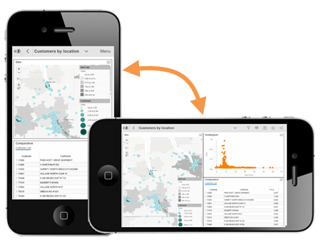
A dashboard can automatically transition to the desktop/tablet layout on large tablets and/or rotated screens in the Salient mobile app. For example, a phone could show widgets in a single column in portrait orientation and switch to a two-column layout when rotated. This feature requires minimal setup in the desktop/tablet layout. |
 |
|
|
Enhance mobile dashboards with more types of widgets. The Salient mobile app can now display:
Buttons, text/HTML and image widgets can be turned on/off for mobile in general settings of edit mode. |
 |
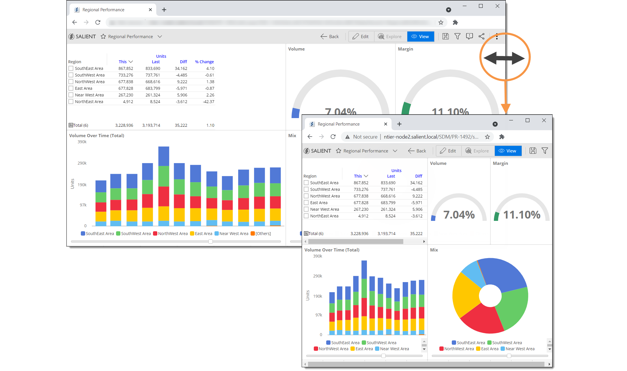
This version offers a new dynamic layout that automatically resizes widgets based on the screen or browser size to provide a better viewing experience on different devices. Existing dashboards will not be affected unless you switch them from a fixed layout to a dynamic layout.